Showing posts with label AF. Show all posts

Tuesday, 17 March 2015

Evaluation: Question 3

What kind of media institution might distribute your film product and why?

To find out what company might be willing to take on our film, Adam researched the types of companies which exist and the types of films they're willing to work with. A distribution company is defined by the fact that, as a marketer, they raise awareness of the film through a range of campaigns. as well as forming deals with other companies (e.g. Sony) in order to aid the DVD, TV and online releases of the feature.

Adam looked at a variety of companies which we could have considered, ranging from small independent British institutions working primarily within the country to companies which distribute films worldwide.

Adam decided a likely group of candidates was the Independent British Companies, which would be more likely to take on a film shot in a quirky style similar to ours, with its stop-motion ident, unnatural colouring and acoustic soundtrack. "Vertigo", especially, seems appealing due to their previous involvement in micro-budget films, including Gareth Edwards' "Monsters". As our film is also a low-budget sci-fi production, the prospects of working with this company are all the more hopeful. Even the institution's limited reach shouldn't be a problem; much like the above film, Adam conjectured that we could then opt for a larger company such as "Magnolia Pictures" to take our feature to other countries instead.
Another viable option for the distribution of "De(i)fied" would be a company such as Film4, as they finance stylised, unique British films. Their past releases have included "Inbetweeners 2", "12 Years a Slave" and "71". Companies such as this are concerned predominantly with financing and international distribution; two things which are very important for small productions like ours. However, Adam found that, despite the fact that the BFI collaborates with many institutes such as this, a company such as Film4 is likely to overlook our product in favour of more easily marketable works, such as multi-genre biopics or comedies. It is likely our film would be too stylistically different to their usual releases for them to actually regard it seriously, and so a company in this vein wouldn't necessarily be an ideal candidate.

To supplement the above, Adam also researched larger studios such as Lionsgate, StudioCanal and Icon, the first of which stood out the most due to their distribution of "The Hunger Games" franchise from which we partially drew inspiration for our own work. However, considering the fact that these are the three biggest distributors in Britain and such companies usually prefer to avoid financing risky productions, our film is, again, likely to be rejected by them. Although we could use the brand name authority and the reach these titans have even outside of the country, the low budget production of the film and its unusual genre combination (indie sci-fi thriller) would likely put it into disfavour with institutions such as this. We would perhaps be more likely to succeed if, before producing the film, I completed the novel which we based its initial premise on and managed to publish it successfully (bringing "De(i)fied" closer to the standard of "The Hunger Games"), but this would take a significant amount of effort and would also postpone the creation of the feature itself indefinitely. Therefore, unless we managed to concretely show that our film was worth the effort in terms of profit, it would seem wiser to stick to companies that would be more likely to take our work on. 

Adam's research makes it clear that the type of company which would be most likely to distribute our film would be a small-scale British indie institution. The eerie atmosphere of our piece, as well as the saturated colours and guitar soundtrack all lend themselves to the type of feature a small production company would ordinarily release. "De(i)fied"'s originality, in this case, would be considered a strongpoint as opposed to a reason to overlook it (conversely to a typical Hollywood blockbuster). Therefore, a company such as "Vertigo" would have to be our first choice.

AF

Sunday, 15 March 2015

Evaluation: Question 6

What have you learnt about technologies in the process of constructing this product?


AF

Thursday, 12 March 2015

Ident: Final Version


This is the final version of our ident, which we physically filmed using a light box and pieces of coloured plastic, as planned. However, we had to cut it shorter than anticipated, meaning we didn't get to use the full length of our stop motion animation. To achieve this effect, we filmed the sequence as normal, and then sped up the footage 4x on Final Cut. The name we decided on, as before, was "Elemental Studios", due to the four colours representing the elements. Originally, we planned to form the name of our company out of the pieces of plastic themselves, but we found this was too complicated and made the title look virtually unreadable. Therefore, despite initially wanting to avoid using Motion, we nevertheless ended up having to familiarise ourselves with it. In order to achieve the above font, we wrote out the name of our company, added a background glow and then deleted the text itself in to mirror the effect of the lightbox. We programmed the text to move towards the audience slightly as the ident played because no movement at all made the whole thing look rigid and unnatural, and this was the simplest, least distracting motion we could use.

We combined the Motion graphics and filmed element in Final Cut, cropping the image in order to centre the circle of plastic on the screen. We then heightened the colour saturation of the red tones on both components in order to give the entire image a warmer, brighter and therefore more eye-catching ambience. In the end, I think the ident turned out significantly better than we could have anticipated; despite being fairly clearly made by a low-budget company, its rough, distressed, shadowy style suits the tone of the rest of our film perfectly.

AF

Sunday, 8 March 2015

Altering Colour

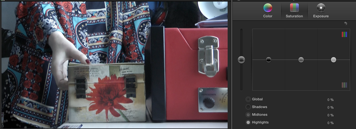
One technique we had been keen to use at our research and planning stage was that of colour alterations, especially as a device to make the contrast between our two leads all the more obvious. Luckily, we had enough time to work out a satisfactory colour pallet after completing our second rough cut, raising the saturation of red shades in frames with Al, and generally draining the colour from Mal's scenes on the  pallet that had the most influence in each shot.

This is likely the most striking example of a before and after comparison. We chose to alter predominantly red shades in Al's scenes due to her clothing and surroundings, and this shot is surely testament to the effective filming and costume choices we made. The effect of such a trivial change ended up turning this shot into one of our personal favourites due to the huge aesthetic difference  colour alteration made to it.


The opposing colour scheme we chose for Mal's shots created a fairly jarring effect due to the viewer having to constantly watch the camera switch between the two throughout the entirety of the opening montage. However, this effect made the contrast between the two girls more obvious, especially in terms of suggesting the difference in their origins; Al's colours are unrealistically vibrant, connoting her alien heritage which we would traditionally view as a break away from the mundanity which Mal's colour scheme represents. For every shot, we picked a different colour to fade depending on the magnitude of the impact it had, such as bringing down the saturation of green here due to the expanse of the field in the background.

However, it quickly became obvious that the shots where the two characters appeared on-screen together would become a problem for us. Reverting to standard saturation in those scenes seemed like a natural decision to make (especially in terms of symbolically highlighting how the two lead's personalities balance each other out throughout the rest of the plot). However, we nevertheless elected that it would look effective if, every time one of the characters left the shot, the colours would revert to those associated with the one who remained. An example of this is shown here, with the first and third shots having a normal colour saturation because Al and Mal are together, but with the middle shot's red saturation heightened due to Al being alone. Despite the cut we had to make halfway through the shot to apply this change, the transition looks fairly smooth in the film itself; something we were rather pleased with, as it would prove an interesting Easter egg for our more attentive viewers.

The final shot of Mal is the only one which we allowed to be an exception to the rule, in order to emphasise the atmosphere of confusion and fear our protagonist finds herself in. These feelings, which the viewer is supposed to emphasise with, meant the shot had to be brighter and sharper, just as the world looks under high tension or stress for us, allowing us to react more quickly to our surroundings. Hopefully, this choice precipitates the cliffhanger effectively, making the audience wonder about the resolution.

In all, altering the colour saturation of our piece to subtly emphasise the film's themes of reflection and parallel worlds was probably one of our best ideas, effectively enhancing not only the strange ambience of our work but also the other clues within the opening (such as the matching key necklaces and the Al's "mother's" unresponsive behaviour). Although the correct balance of both enhancement and discolouration was at first difficult to find, we eventually realised that the optimal saturation value to use for most shots was +/-50% (discounting special cases where this created an effect too unrealistically bright or dark). It was also interesting to learn that certain colours were significantly more present in our environment than anticipated, as shown by, for instance, a change in green saturation affecting certain brown colours, such as that of bricks. The change we made, overall, is not only interesting but attractive; the normal colours of the footage, while seeming perfectly fine before, now seem in some way unacceptable in comparison.

AF

Tuesday, 3 February 2015

Shooting Schedule


This is the shooting schedule which Adam had to rewrite due to one of our actresses quitting on us (again). It seems, however, that we were third time lucky, as this time the person playing Mal seems determined and eager to help. We aren't sure which particular days of the above weekends we'll be filming on, but we know exactly which props and equipment we need, which should suffice. 

AF

Tuesday, 9 December 2014

Graphics: Placement of Opening Titles

Adam and I had to consider where the all-important title would be placed within our opening, and decided that the pivotal scene when the two girls first cross paths would probably be the most effective shot to introduce our movie in. The titles for our actors and other helpers will naturally be incorporated into the initial scenes where the girls are getting ready, but the timing of the title itself posed some problems for us until we finally worked it out. Although we haven't yet begun our storyboard, Adam created some rough computer graphics in order to illustrate or various ideas on how to position the name within the shot. It runs when the two girls walk towards each other from either end of "Lover's Walk", after which they pass each other and girl A stops, turns around, and follows girl B. Whichever font we use, the letters will disappear one by one as the two characters pass them.

This is an approximation of the shot. In the real thing, trees and bushes may get in the way of the shot being structured exactly as we want (as might passers by), but we'll simply have to work around that when we get there. 


The most basic idea would be just putting the title between the two characters with no extra animation. And, as before, the extended "I" would serve as a marker for how the title has a dual meaning. 

Another idea was that the title could appear and then the "I" would extend past the parallel framing until it reached the ground. This would imply the fact that the two girls are from parallel universes, and also create a pleasing aesthetic split in the image. It would also follow our idea of using mirrors as much as possible in our filming in order to highlight the otherworldly origins of girl A. However, not only would this be difficult to do, but the line would also be skewed to the left, and would therefore not look particularly good due to the lack of symmetry.

 In terms of the other font, it is possible to slide the two halves of the word towards each other, hiding the 'i' as the girls walk towards the centre of the screen. This could more clearly illustrate the double meaning of the title. This is an especially effective idea due to the fact that the two halves sliding together will smoothly copy the movement of the two girls.


This idea would be graphically challenging but remains arguably be the most effective one in our arsenal. In this, the letters fade out as they walk past them just as in previous renderings of our title.


However, in this case, the '(I)' remains and, as the two come closer together, the brackets circle each other and turn into an eye. The eye fades out as they cross each others paths and carry on.


Granted, the eye looks almost like the Eye of Sauron from the "Lord of the Rings" films, not to mention that we'd have to use the font from "Alien" for this idea to work. The danger of frustrating our viewer aside, however, this idea fits perfectly with the feeling of paranoia and being watched that we want to create in our film.  

There, of course, cannot be a final decision until we actually complete this shot and can play around with it in editing. Not to mention, it would be nice to ask a couple people their opinions of these ideas anyway, in order to see if they think the fonts fully convey the double meaning of the title, as well as seeing whether people recognise the "Alien" font. 

AF

Saturday, 6 December 2014

Ident Research

Idents are sequences that appear at the beginning of films to show which companies had produced and distributed it. They are essentially like a seal or signature, often assuring quality as well as simply showing ownership. Most idents of popular studios and companies are instantly recognisable due to their frequent appearance on our screens. The most common are those of the studios often reffered to as "The Big Six".


Adam and I decided that, since we can't use "Motion" (which our teacher ordinarily recommends to students for the creation of idents) and neither one of us is particularly good with technology, we should attempt a stop-motion ident instead of a computer-generated one. At the moment, we're thinking of using coloured plastic and a light box to do this, but of course we'll have to see if that's even possible. Not to mention, we do not yet have a name or idea for our studio. However, at the moment I personally am leaning towards linking the name/imagery with one of the four elements, especially fire, because the colours we could use would look very effective if lit up correctly. A previous student had also made a stop-motion ident and, hopefully, we can make something similar. 


One particular ident that I personally would like us to draw inspiration from is that at the beginning of this video, which is a trailer for the previously mentioned video game "Alice: Madness Returns" created by American McGee. Of course, we won't be able to do anything even remotely as complex, but I like the idea of the paper-effect triangles forming the face of the Cheshire cat in this ident.


Since we will be using coloured plastic and a lightbox, the effect we wish to achieve can also be likened to that of Pathé's ident.


Additionally, it is to be noted that a lot of some of the most successful idents use multitudes of bright colours in order to appear more eye-catching. The circles often implemented in them is also telling of the aesthetic appeal of that particular shape, and as a result we've concluded that we are likely to create an ident in a similar overall shape (circular or elliptical) as well. TV channels such as Watch and BBC One are instances of this. 


Similarly, some video examples of this idea also include studios such as Firefly Entertainment and Criterion Collection.


Adam was particularly impressed by the revolving effect in the above idents due to the feeling of style and professionalism this created, and so I think this may be something we will attempt to recreate in our own work. However, as we will likely not be using Motion, our ident will hopefully look more naturalistic and unique due to our planned use of stop animation techniques.

AF

Film Influences: "Fight Club"

In order to get a better understanding of the sorts of techniques we should use to hint at something being off in the world of our film, Adam researched the clues hidden in "Fight Club". There are constant implications of the film's ending throughout, and these are deployed very cleverly. If we could muster even a portion of the skill shown here, our work should come together rather well.


AF

Graphics

The name of our film is currently undecided, but at the moment we are using the working name from my pitch, "De(i)fied", as this can be read as "deified" or "defied". This name suits the story, at least for the moment. The word "defied" is relevant because the girls will be forced to show a great deal of that in order to survive the events of the movie. They could also practically be compared to deities as they are responsible for saving our world as we know it. Similarly, girl A would seem almost goddess-like to girl B, simply because she is from a parallel universe and is therefore completely alien to her.

On the topic of aliens, then, one of the fonts we're considering using for our title sequence (sourced by Dafont) is that from the movie "Alien". This film is also among our influences, mostly due to its strong female lead.


 The font highlights the 'i', meaning it is easier to spot the ambiguous meaning of the title. The chief drawback, however, is that this font is already very recognisable, and could cheapen the effect of our own film, making it look significantly more amateur than we'd like.

We are currently leaning towards the second option out of the two, however, as it has the added effect of making the letter look like a slitted pupil, adding to the sense of unease and alienation (HA) we're aiming to create. This can even be enhanced in editing if we decide to use this font after all.

The alternative font, which Adam picked out, looks like a better idea to me, simply because it is less well-known (it isn't used in anything; it's just a font), and also because Adam took the time to edit it into how I originally envisioned it. He has some reservations about it, so we may need to get some second opinions about whether or not people can tell that the font is implying a dual meaning. 
Other than that, however, it seems these two are our chief contenders for our opening title sequence.
I must admit, I do still remain somewhat partial to one of the fonts proposed in my initial pitch. It's not necessarily better than the font above, in my opnion, but I'd liek to repost it for consideration anyway, just because I think it's aesthetically pleasing enough that it should at least be considered.

AF