 This is likely the most striking example of a before and after comparison. We chose to alter predominantly red shades in Al's scenes due to her clothing and surroundings, and this shot is surely testament to the effective filming and costume choices we made. The effect of such a trivial change ended up turning this shot into one of our personal favourites due to the huge aesthetic difference colour alteration made to it.
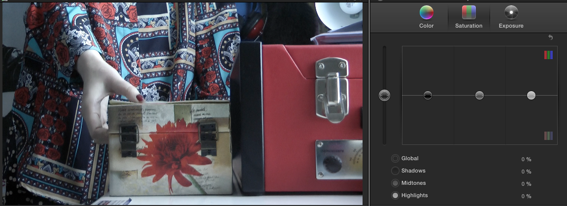
 The opposing colour scheme we chose for Mal's shots created a fairly jarring effect due to the viewer having to constantly watch the camera switch between the two throughout the entirety of the opening montage. However, this effect made the contrast between the two girls more obvious, especially in terms of suggesting the difference in their origins; Al's colours are unrealistically vibrant, connoting her alien heritage which we would traditionally view as a break away from the mundanity which Mal's colour scheme represents. For every shot, we picked a different colour to fade depending on the magnitude of the impact it had, such as bringing down the saturation of green here due to the expanse of the field in the background.

 However, it quickly became obvious that the shots where the two characters appeared on-screen together would become a problem for us. Reverting to standard saturation in those scenes seemed like a natural decision to make (especially in terms of symbolically highlighting how the two lead's personalities balance each other out throughout the rest of the plot). However, we nevertheless elected that it would look effective if, every time one of the characters left the shot, the colours would revert to those associated with the one who remained. An example of this is shown here, with the first and third shots having a normal colour saturation because Al and Mal are together, but with the middle shot's red saturation heightened due to Al being alone. Despite the cut we had to make halfway through the shot to apply this change, the transition looks fairly smooth in the film itself; something we were rather pleased with, as it would prove an interesting Easter egg for our more attentive viewers.
 The final shot of Mal is the only one which we allowed to be an exception to the rule, in order to emphasise the atmosphere of confusion and fear our protagonist finds herself in. These feelings, which the viewer is supposed to emphasise with, meant the shot had to be brighter and sharper, just as the world looks under high tension or stress for us, allowing us to react more quickly to our surroundings. Hopefully, this choice precipitates the cliffhanger effectively, making the audience wonder about the resolution.
In all, altering the colour saturation of our piece to subtly emphasise the film's themes of reflection and parallel worlds was probably one of our best ideas, effectively enhancing not only the strange ambience of our work but also the other clues within the opening (such as the matching key necklaces and the Al's "mother's" unresponsive behaviour). Although the correct balance of both enhancement and discolouration was at first difficult to find, we eventually realised that the optimal saturation value to use for most shots was +/-50% (discounting special cases where this created an effect too unrealistically bright or dark). It was also interesting to learn that certain colours were significantly more present in our environment than anticipated, as shown by, for instance, a change in green saturation affecting certain brown colours, such as that of bricks. The change we made, overall, is not only interesting but attractive; the normal colours of the footage, while seeming perfectly fine before, now seem in some way unacceptable in comparison.
AF
No comments:
Post a Comment